// article
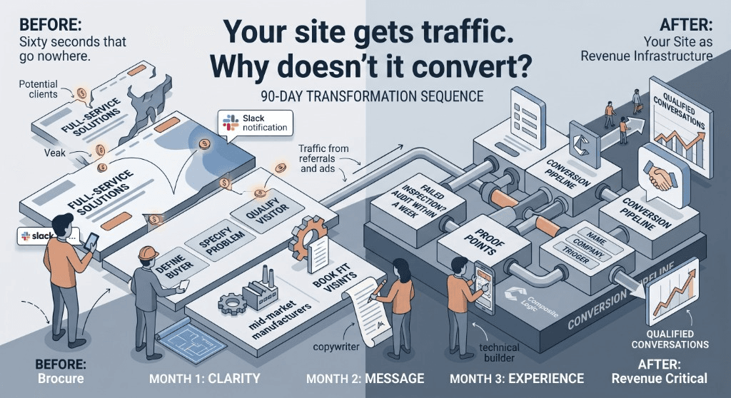
Your site gets traffic. Why doesn't it convert?
Follow one 60-second visit that goes nowhere—and what changes when clarity, message, and experience are built in order over 90 days.
Your site gets traffic. Why doesn't it convert?
Sixty seconds that go nowhere
An operations director gets a referral over lunch. Back at her desk, she opens the link on her phone.
The homepage loads. Logo, hero image, three lines of text:
Full-service solutions for businesses of all sizes.
Innovative. Trusted. Committed to excellence.
She taps Services. A wall of offerings—consulting, implementation, support, training—none tied to the problem she actually has. She opens a competitor in another tab. Closes yours.
No form. No call. No signal in your analytics except another bounce.
That pattern is familiar to B2B services firms, professional practices, and growth-stage companies already paying for ads and referrals. The fix is rarely more spend. It is the site.
That is not a traffic problem. It is a brochure problem.
The relaunch that changed nothing
Six months later the same firm launches a new site. Fresh typography. New photography. A case-study carousel.
Launch-week traffic looks fine. By week three the pattern is identical: visits up slightly, qualified conversations flat. The stakeholder asks what went wrong. Nobody can point to a single page that lost the buyer—because the new design never answered three questions the old site skipped too.
| Skipped step | What the new site still could not answer |
|---|---|
| Clarity | Who this is actually for |
| Message | Why act now instead of next quarter |
| Experience | What to do on a phone in eight seconds |
They paid for a redesign. They needed a sequence. Skip clarity and message before you build, and you rebuild the same site twice.
Month 1: Get clear before you build
In the conference room someone says the site needs a refresh. By Friday there is a mood board. Nobody has written down who the site is for.
Compare two homepages—illustrative, not a client result:
A homepage that reads like a brochure:
Full-service solutions for businesses of all sizes.
Innovative. Trusted. Committed to excellence.
A homepage with clarity locked:
Operational audits for mid-market manufacturers
when a failed inspection stops the line.
The second version is narrower. That is the point. It qualifies the visitor in one screen.
The objections from sales calls still need a home on the site:
| Objection on calls | Where the site must answer it |
|---|---|
| "We have never worked with a firm your size" | Case outcomes from similar manufacturers |
| "How fast can you be on-site?" | Response-time proof on the service page |
| "What does this actually cost?" | Scope and pricing signals—not "contact us for a quote" as the only path |
By end of month one you should hold a one-page positioning brief, a buyer journey with gaps marked, and a page inventory tied to revenue—not the org chart. If positioning is fuzzy here, no amount of copy or polish fixes it later.
Month 2: Make every page pull its weight
The same operations director tries again—this time from a paid ad. She lands on Services.
What she sees today:
Comprehensive Consulting Services
We partner with organizations to drive transformative outcomes
through best-in-class methodologies and industry-leading expertise.

[ Get a Quote ]  [ Learn More ]  [ Subscribe to Updates ]
Three buttons. One problem still unnamed. She leaves.
What holds her:
Failed inspection on the line?
On-site operational audits for mid-market plants—
typically scoped and scheduled within one week.

[ Book a 20-minute fit call ]
One problem. One proof point. One action.
Read both versions out loud. The first sounds like a brochure because it is one.
Month 3: Build for how people actually decide
Good copy in a bad experience is still a brochure. She tries the fit-call path on her phone during a plant walkthrough.
The menu icon is buried in the header. The hero image loads slowly on LTE. The contact form asks for company size, annual revenue, project timeline, budget range, and how she heard about you—fourteen fields before she can submit.
She puts the phone away.
What changes when experience matches the message: the path from home to service to contact fits in three taps. The form asks for name, company, and what triggered the search. A line of proof sits next to the submit button—response time, not a generic trust badge. The page loads before she loses patience.
At day ninety the test is simple: can a qualified visitor complete the path she abandoned in sixty seconds?
What a monthly review looks like
Growth is not a feeling. Here is the kind of note a monthly review should produce—illustrative numbers, not a client result:
847 visits from ads and referrals. Two form fills—both staffing inquiries, not buyers. Services page: 40% of entries, 12-second median time. Contact page: 6 visits, zero submits.
That pattern points somewhere specific. Wrong leads mean clarity. Right visitors who leave fast mean message. Visitors who reach contact and stop mean experience. Fix the layer the data names—not the symptom that is easiest to spot.
What ships in ninety days
Most teams stall because clarity, message, and build live in separate workstreams—or because momentum dies at month two. Composite Logic runs the full arc on one thread, execution-close:
- Week 2: a positioning brief the sales team recognizes on the first read
- Week 6: core pages rewritten against the objections that actually show up on calls
- Week 10: the mobile path tested on the entry pages that drive most traffic
- Week 12: baseline analytics on the actions that matter—not vanity pageviews
Same people shape direction and ship the work. When go-to-market matters, what you say, what you show, and what you ship stay connected—accountable to what goes live, not a shared doc that nobody reads. This is the heart of our web development service.
If your site gets the visit that goes nowhere, start a conversation—brief context on your business and what is not working is enough to determine fit.